
Telecom Product
Configurator Redesign
Elevated a complex enterprise configuration system for one of Europe's largest telecommunications providers, driving a significant reduction in abandonment through comprehensive UX strategy and iterative design.
Role
UX/UI Designer
Industry
Telecom
Client
Enterprise
Duration
4 Months
A configurator losing customers at every step
The existing product configurator suffered from a critical abandonment rate due to high cognitive load and ambiguous steps. This translated directly into lost sales and unsustainable escalation costs in the support center.
"As a customer configuring a telecom package, I am confronted with too many options at once, with unclear pricing and no clear indication of the next step. I feel unsure about my choices and cannot easily review or change selections. So that I feel overwhelmed and confused, often abandoning the flow or needing to contact support."
The problem generated significant business risks: hindering conversion due to low user confidence and escalating operational expenditure through increased support workload.
Revenue Loss
High abandonment rates translated directly into lost sales and missed conversion opportunities.
Inefficient Marketing
Marketing spend driving traffic to a configurator that failed to convert, reducing campaign ROI.
High Support Load
Confused users escalated to the support center, creating unsustainable operational costs.
Based on the problem statement and identified business challenges, we defined two main goals to align all stakeholders and create a shared understanding of the project direction.
Maximize Conversion & Confidence
Create a seamless, transparent flow to reduce abandonment and increase customer confidence at the point of purchase.
Sustain Revenue Growth
Encourage high-value cross-selling by ensuring all offers are presented as optional, valuable choices that preserve user trust.
Evaluation & Insight
- Heuristic Evaluation
- UX Principles & Gestalt Analysis
- Internal Usability Testing
Concept Development
- Flow Design
- Wireframe & Interaction Concepts
- Validation with Stakeholders
Design & Delivery
- High-Fidelity Prototyping
- Feedback & Iteration
- Hand-Off & Design Guidelines
Evaluation & Insight
Heuristic Evaluation
Visibility of System Status
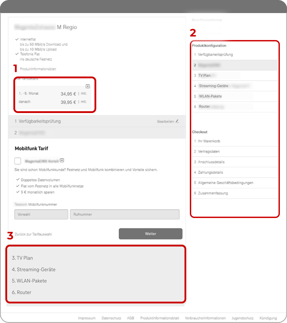
The lack of a clear progress indicator led to user disorientation and failure to map progress between the configuration and the checkout funnel.
Error Prevention
Misleading elements, such as ambiguous pricing and redundant configuration steps, increased the risk of costly input errors.
Consistency and Standards
Inconsistent design patterns and hierarchy issues introduced ambiguity, requiring users to repeatedly re-learn navigation.
User Control and Freedom
Users had limited means to easily review or edit previous product selections, forcing unnecessary abandonment or full restarts.
Evaluation & Insight
UX Principles
Miller’s Law
The combined presence of configuration, mobile upsell, and checkout steps exceeded the limits of working memory, causing cognitive overload.
Jakob’s Law
Users expected a single, linear path for checkout; the parallel configuration/checkout lists violated this mental model.
Hick’s Law
Excessive choices were presented simultaneously, directly leading to decision paralysis and slower completion rates.
Evaluation & Insight
Gestalt Analysis
In the second step of this stage, we focused on Gestalt analysis to understand how visual grouping and perception influenced the overall user experience.

Proximity
Contract and payment details shown too close causes confusion.
Similarity
Visually identical step lists (Configuration steps vs. Checkout steps) led to confusion and reduced system clarity.
Prägnanz
Cognitive Overload: Violation of simplicity directly contributed to decision paralysis and abandonment.
Evaluation & Insight
Internal Usability Testing
We ran a quick internal test to confirm whether the insights from our heuristic and design principles evaluation were reflected in real user behavior.
Evaluation & Insight
Key Insights
After completing the heuristic evaluation, reviewing UX principles, and conducting internal usability testing, several key insights emerged. These findings revealed recurring usability issues and design inconsistencies that affected the user flow and decision-making process.
No progress indicator
Users were unsure about total steps and overall progress.
Limited freedom
Users couldn't easily edit or double-check their selections.
Checkout overload
Too many details were presented at once, causing friction.
Visual hierarchy
Inconsistent UI elements made scanning and decision-making difficult.
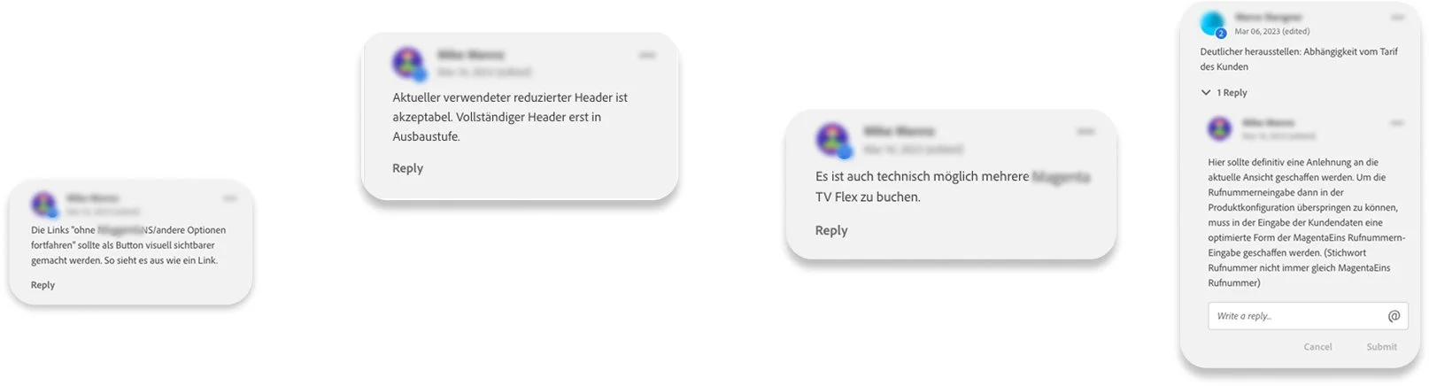
Validation of Stakeholders
After presenting the redesign concept and initial wireframes, the customer shared detailed feedback. Their input played a key role in shaping the redesign, from refining specific features to improving overall usability. This collaborative step ensured the updated design directly addressed the spotted problems and aligned more closely with the customer's expectations.
Modular Configurator Approved
The client fully approved the design and approach of the new modular configurator. This tool is essential for guiding users through complex, customized product selections.
Sequential Flow Mandate
The client required a sequential path to maximize cross-selling, though they approved the flexibility to skip one step using the "Go to Cart" button at the bottom of the page.
Business Strategy Reinforced
The generally sequential flow was maintained and reinforced because it is mandatory for maximizing cross-selling opportunities at specific, required points in the user journey.
Progress Indicator Confirmed
The existing Progress Flow indicator was confirmed as essential. It is a vital design element that helps users stay oriented and mitigates confusion resulting from mandatory, unskippable steps.
High-Fidelity Prototype
The experience is transformed into a clear, confidence-driven flow. This visual solution directly validated our strategic goals of reducing friction and increasing customer trust.
"As a customer configuring a telecom package, I can move through a clear, step-by-step modular flow, where my progress is always visible and I am only presented with decisions relevant to the current stage. I can confidently check out because the pricing is transparent and I have the freedom to review or change previous selections easily. So that I feel informed and in control, leading to a high-confidence purchase completion."
Empowering Control & Flexibility
The design resolves previous user frustration by providing clear routes for process control. Customers can instantly change selections via the "Auswahl ändern" links and skip modules, and use the persistent navigation.
Visible Progress
The prominent Progress Indicator on top and the vertical module status icons work together to provide continuous orientation and process control throughout the journey.
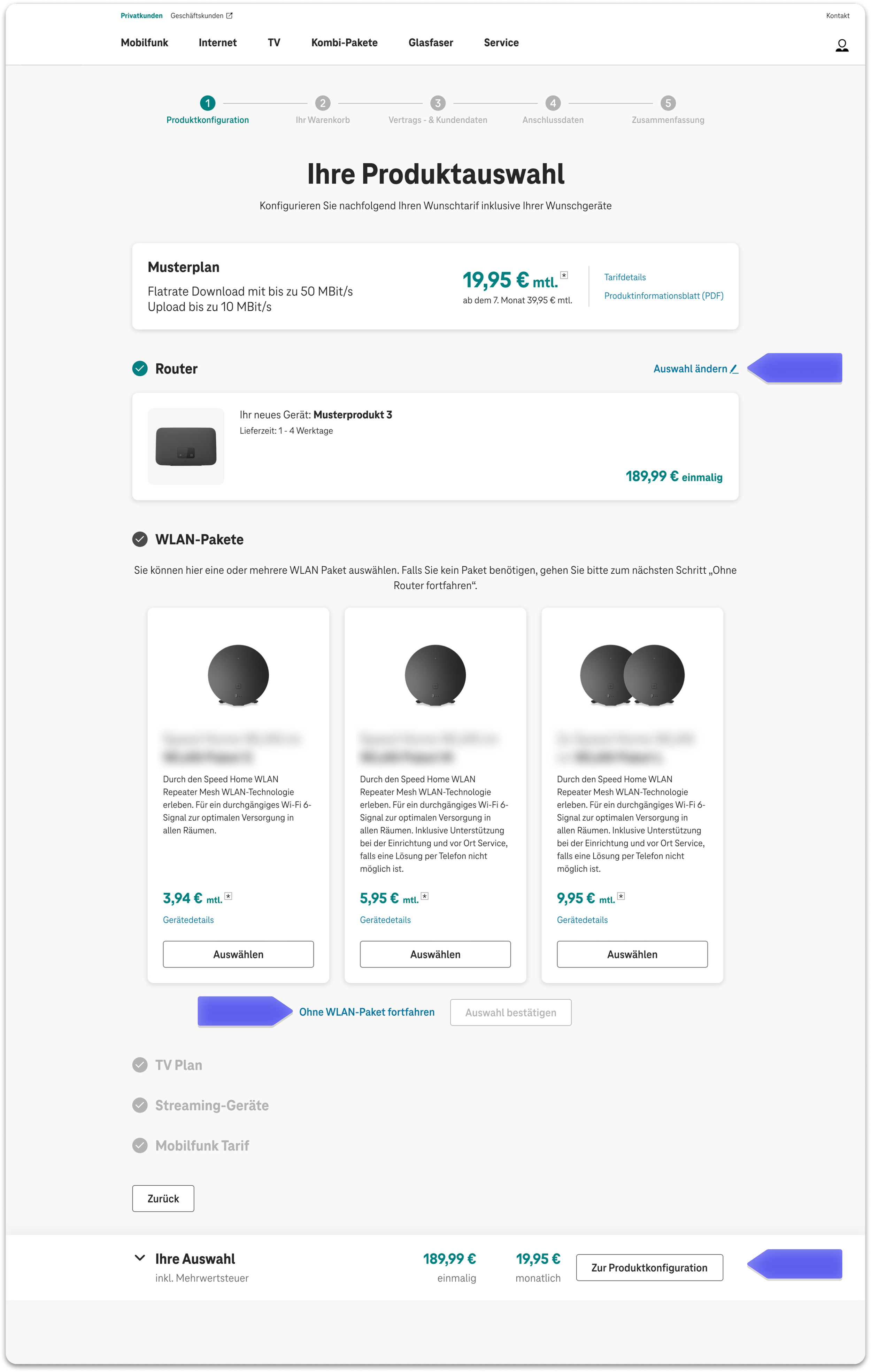
Sticky Summary Bar
The persistent Sticky Summary Bar guarantees confidence by always displaying key totals (monthly/one-time). This bar is expandable for a detailed review of all configured items before checkout.
Progressive Disclosure
The primary content area is structured into clear, sequential modules (e.g., Router, TV Plan). This design enforces Progressive Disclosure, successfully reducing the initial cognitive overload and ensuring the customer is focused only on the current decision.
Feedback & Iteration
Following prototype delivery, we managed a crucial alignment phase, demonstrating the ability to negotiate complex trade-offs. We addressed essential constraints including:
Technical Feasibility & Use Cases
EngineeringThe availability check is used to manage requirements for two distinct user journeys — new clients and switchers — ensuring that contract data is displayed correctly based on each user's initial status.
System Alignment
BrandingUtilizing a reduced global header and footer to maintain brand identity while eliminating menu distractions and preventing abandonment.
UI Clarity
UsabilityImplementing product counters for multi-quantity items and adjusting text blocks to enhance user comprehension.
Conversion Optimization
BusinessIncreasing the prominence of the final-stage selection module with a toggle that guides users to easily bypass sections, reducing friction and drop-off.
Design Hand-off
To ensure a smooth transition to the client’s in-house development team, we prepared a comprehensive handoff package focused on technical accuracy and visual consistency.
Detailed Documentation
We delivered ready-for-development files alongside detailed implementation guidelines to help developers maintain visual accuracy throughout the coding process.
Responsive Optimization
The final design was optimized for four responsive viewports, ensuring a consistent and seamless user experience across all devices and screen sizes.

Strategic Impact
Redesign success was confirmed. The new system resolved fundamental complexity issues, drastically cutting customer abandonment and improving cross-sell success.
Increased Customer Trust
The transparent pricing strategy led to positive user feedback. It directly reduced confusion and lowered the potential for costly support calls.
Cross-Sell Success
Confidence-focused presentation of mobile tariffs achieved a positive lift in attach rates, supporting Sustaining Revenue Growth.
Reduced Friction
Substantial improvement in completion rates was confirmed by resolving systemic issues like cognitive overload and disorientation.